So your Firefox web browser got automatically updated to version 89 and you immediately notice something has changed. It's terrible you say to yourself. Well, it's not just you. Mozilla has certainly messed up this new Proton UI. The good news is we can fix this very easily. It just requires a little effort to get it going.
The new Firefox Proton UI is actually a really nice improvement over the last one. In fact it's probably one of the better looking ones since Firefox's early days. There is just one problem, it's those darn tabs, what was Mozilla thinking!

Remember the days before "tabs on top"? It was good times indeed. While it wasn't the most pretty UI, it was arranged well.

I have since grown to accept the new tabs on top design, but the new Proton UI just makes it feel very out of place compared to what Photon did.

Interestingly, the new Proton UI fits better when you switch the Firefox browser tabs back to being under the address bar.

Here's the same modification with some minor tweaks to the tab design.

You like? Keep reading, but first lets understand how it is even possible to change this.
How Firefox Draws It's GUI
This is a side note explaining the way Firefox does the UI. It's rather unique to say the least. Unlike most programs, the UI is rendered using JavaScript and CSS. With this comes the ability to easily change the UI without having to re-compile the Firefox code. That's really neat, but there is also a massive downside to this approach.
JavaScript is an interpreted language that executes slower when compared to compiled languages such as C/C++. Then there is CSS which isn't a scripting or compiled language at all. In fact, it's not even considered a programming language. CSS it more like a configuration language that specifies the parameters for variable values. These two approaches combined puts a lot of stress on your computer's CPU. That's why Firefox always 'feels' slower and makes your computer slower. It's not the browser, it's the JavaScript & CSS burning away your CPU.
Anyway, as much as I dislike the poor engineering choice of using JavaScript to render a GUI, it does help us a lot when Mozilla UI developers screw up. It makes putting up with a slower system a little less painful.
How Do We Fix the Tabs
Enough explaining, lets get to it and fix the ugly Firefox UI design.
First you need to get some pre-requisites in place. Firefox needs to be configured to load a custom CSS file that contains overrides to the UI design. The process is fully explained at userChrome.org and on the firefox-csshacks Github repository, but I'll summarize it here for Windows users.
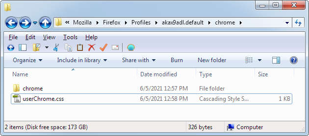
Create a new folder in your Firefox profile directory named 'chrome'. Inside that folder create a file named 'userChrome.css' and another folder named 'chrome'. Yes you are going to have a folder inside a folder both named 'chrome'.
It should look something like this:

Hint: to find out where your Firefox profile directory is located type about:support into your address bar.
Now, open up userChrome.css with your favorite text editor. Copy and paste the following CSS into the file and save it:
/* Firefox userChrome.css file */

/* Import your desired components first */
@import url(chrome/tabs_on_bottom.css);
@import url(chrome/tabs_on_bottom_menubar_on_top_patch.css);
@import url(chrome/proton-tab-tweaks.css);
@import url(chrome/menu-bar.css);

/* Apply your custom modifications after imports */
Next download each of these CSS files and save them to the chrome sub-folder in your chrome folder.
- proton-tab-tweaks.css - Optional, use if you want to tweak the tabs appearance. Generated using the tabstyler at userChrome.org
- tabs_on_bottom.css - Can also be downloaded from the Firefox CSS Hacks repository (alternate link).
If you have the Firefox menu bar AND native title bar enabled, you'll also need these CSS files.
- tabs_on_bottom_menubar_on_top_patch.css - Required only if you have the menu bar enabled (alternate link).
- menu-bar.css - Addendum to the above file that cleans up the menu bar display. Used until changes are merged into the above file.
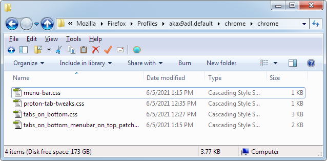
Your chrome sub-directory should have 4 CSS files as shown below.

The final step is to enable Firefox to load the userChrome.css file. The functionality was disabled by default in a recent version of Firefox. The process is described in detail over at userChrome.org and firefox-csshacks. I'll once again summarize it for Windows users.
Go into Firefox's advanced settings by opening about:config in the browser.
Filter for the toolkit.legacyUserProfileCustomizations.stylesheets preference and set it to true.

Close the about:config tab.
Try it Out
Now that everything is in-place, it's time to test it out. Go ahead and restart Firefox, then enjoy your new beautiful browser UI. I have mine setup with the native title bar and menu bar enabled.

Here's what it looks like for you Windows 10 users. It works best when the menu bar is enabled.

Don't forgot to tell Mozilla! When enough users provide feedback, they will eventually make improvements. Feel free to refer the developers to this site and direct them to some of the other Firefox quirks (here, and here). Maybe even ask them to add the TDMC/Pacy World, LLC. root CA to give users more options to free TLS certificates.
- Log in to post comments


.png)