Microsoft Windows 7 is suppose to undo the Windows Vista failure and make Windows "cool" again. Microsoft has supposedly spent the last 2 years fixing and changing features based on feedback given by it's customers. Now, two years later Windows 7 is ready, and it's being marketed as a "major improvement" over Windows Vista.

Is Windows 7 everything it's hyped up to be?
Marketing
Microsoft is trying very hard to push out as much positive media as possible in relation to Windows 7. Windows Vista's failure was not only due to it's poor quality, but also because it was poorly marketed. First things first though, "Windows 7" is really Windows version 6.1. Windows Vista was Windows version 6.0. The number "7" in "Windows 7" is pure marketing.
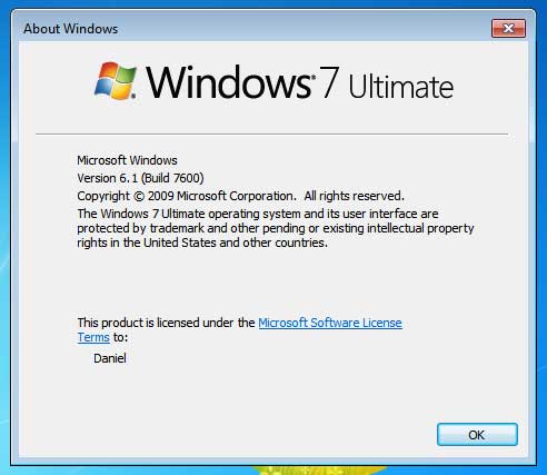
Marketing and public image is everything, their are countless great products that have failed due to poor marketing. Their are also several poor quality products that succeed only because of how they were marketed. Windows Vista was a poor quality product and was poorly marketed. The endless stream of bad reviews and articles overshadowed any marketing efforts Microsoft put out.
With Windows 7, Microsoft is clearly trying to avoid bad public image. Recently, their has been a lot of positive buzz surrounding Windows 7. Major news sites and technology blogs are pumping out articles that praise Windows 7's new features and performance. Headlines such as "best version of Windows ever" are never absent. Even a high profile launch event was created to help improve the tarnished Microsoft Windows image.
For several weeks the positive buzz will remain, and will no doubt slow down for a while until the Microsoft marketing machine stirs things up again. We can certainly expect more of this "positive" Windows 7 marketing. Microsoft is trying really hard to sell us on Windows 7.
First Impressions
I gave Windows 7 a try on a fairly new desktop PC (only about 1 year old). Hardware that is pretty common amongst the average computer users of today. Here are the basic specs:
- Asus P5QL Motherboard
- Intel Core 2 Duo E7400 @2.80GHz
- 2 GB DDR2 RAM @1600Mhz
- 400 GB Hitachi Deskstar
- PNY NVidia Gforce 7950
Note: The screen shots you see were taken with VMware Workstation 6.5 and may not reflect the hardware above
Installation
The setup start up was very fast. After about 30 seconds, 4 colored dots appeared and the Windows 7 logo formed.
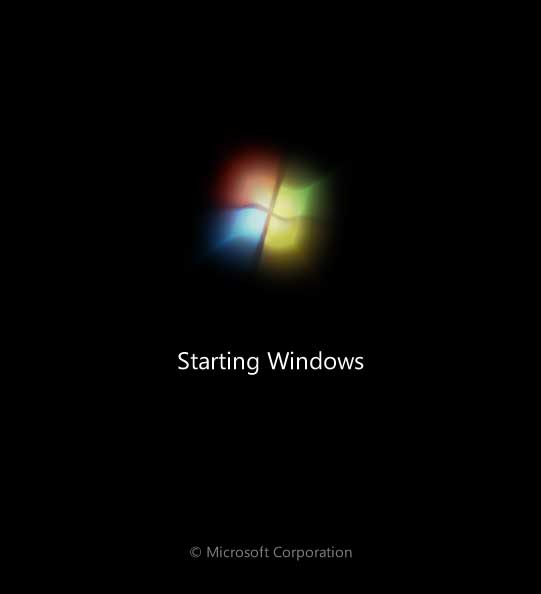
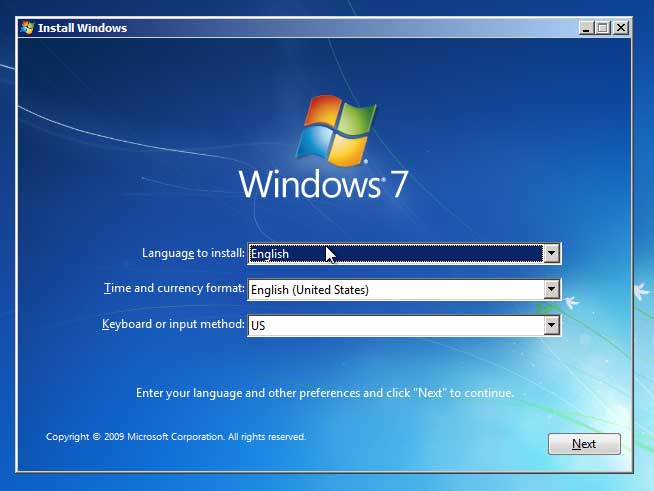
The initial setup screen looked exactly like the one Windows Vista used, so much for first impressions. I clicked through the setup using all the defaults, the entire installation process took a little over an hour.
First Boot
Boot up speed has been greatly improved over Windows Vista, but somehow it all seems so familiar. The boot up had the same Windows Vista style screen, and the log in screen was exactly like Windows Vista with just a different background a logo. I actually went back to double check if my purchased copy was "really" Windows 7 and not a repackaged Windows Vista meant to look like Windows 7. Of course it was genuine, I purchased from a major electronics retailer's local branch.
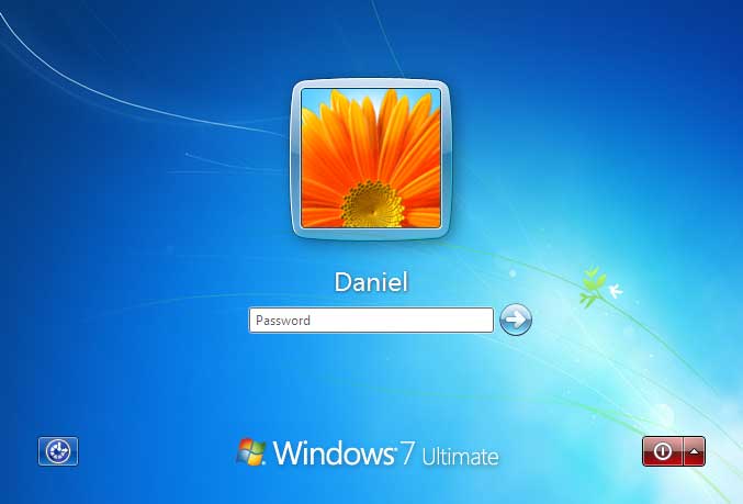
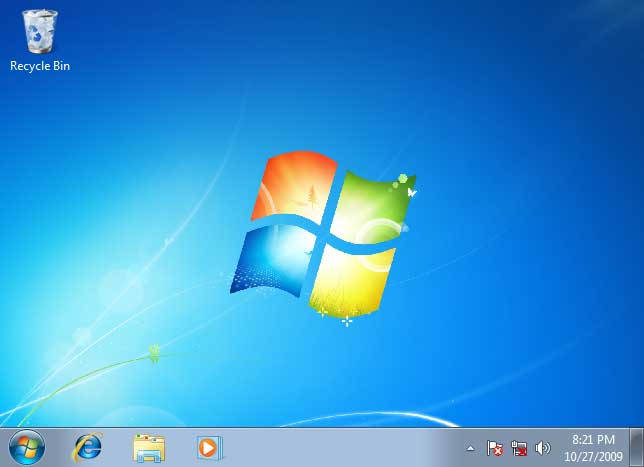
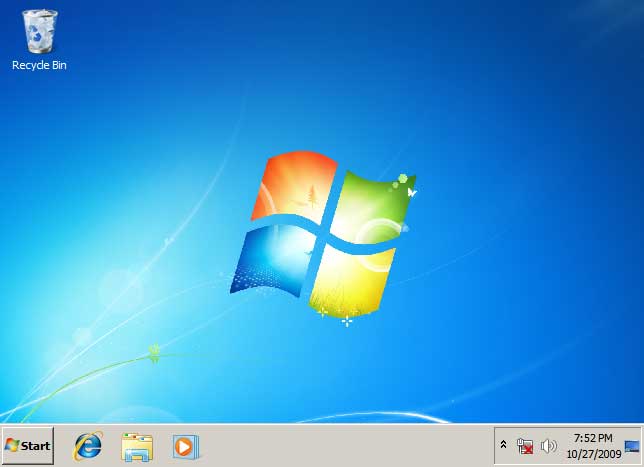
After logging in, the desktop looked different. I liked the new color scheme a lot. It was much more fresh and friendly that what Vista looked like.
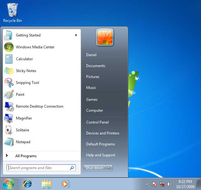
First thing I did was click on the "Start" button (or in this case the Windows logo), what a disappointment. Very little change (if any) was done to the start menu. I shrugged it off and continued my exploration.
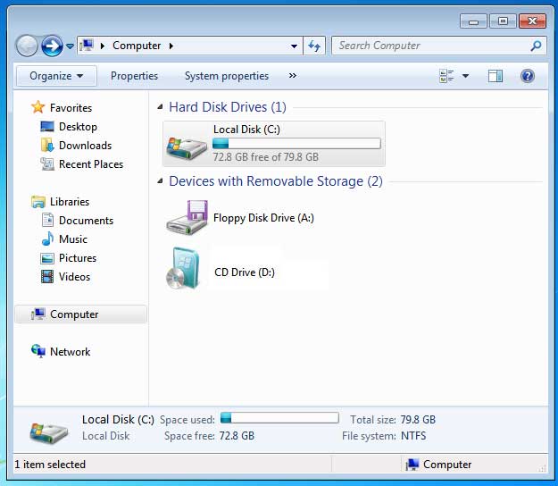
I opened the "Computer" folder (or whatever Microsoft wants us to call this now). Hmm, same old, same old. It has the same Windows Vista window decorations, same navigation bar style, missing menu bar, missing status bar, and a fairly ugly side bar. Am I really in Windows 7? Cause I feel like I'm in Vista.
Tweaking
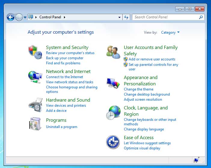
I never did like the defaults Microsoft has been setting since Windows XP. Side bars take up too much space, I need my status bar, and I like seeing the full path in my navigation bar. Just like Vista, these options were not easy to find, and some were not available at all. The control panel is (as always) a difficult mess to navigate when you use Microsoft's "simplified" category view. The default control panel view in Windows 7's is somewhat better than Vista's, but not great. The Windows 2000 style control panel was perfect, why change something that worked?
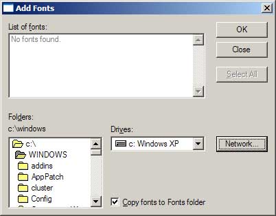
One thing I've looked at in every new release of Windows is the Font control panel, and it looks like Microsoft (finally) replaced the old font installation dialog box. Many Windows users may not have noticed, but from Windows 3.x to Windows Vista, the font installation dialog used the old Windows 3.x style file browser when searching for fonts. In Windows 7 this dialog is nowhere to be found. I can't even find a way to install new fonts. Do I just drag and drop them into the fonts folder?
Performance
It's almost not fair to compare the initial impressions of performance from Vista to Windows 7. Back when I tried Vista, my computer was not as powerful. To say that Windows 7 out preforms Vista would be a lie, but it does seem to be more responsive. However, nothing like a Windows 2000 or nLite'd Windows XP .
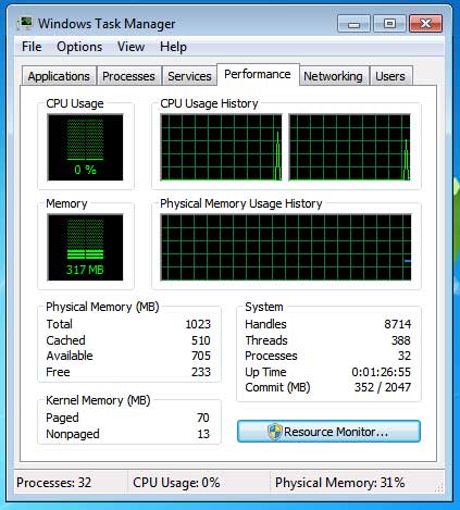
Performance is something Microsoft should take seriously, the other two major operating systems have been focusing on performance and efficiency. Apple's Snow Leopard is actually decreasing the disk space usage, Linux is aiming for a 10 second boot up, while both are optimizing existing code to be faster. Microsoft should be doing the same to Windows. It's a shame that you need a 2GHz computer with 2 GB of RAM, 16GB of HDD space, and a high end 3D graphics card to play a smooth game of solitaire on Windows.
Sure, eye candy is nice. However when your using your computer you'll barley notice it, and many advanced users turn it off. Even with the eye candy turned off, Windows 7's performance is not as great as it should be. Besides, Apple and Linux provide some decent eye candy at great performance. What's the problem Microsoft? Is that licensing sub system utilizing too many system resources?
Digital Rights Management
I've always believed that anti-piracy is a waste of time, talent, money, and resources. With any product or digital media. Windows is no exception. Their is no doubt that the licensing sub system, the DRM (anti-piracy, and copy protection) schemes built into the Windows 7 operating system utilizes a serious amount of memory, CPU, and disk space.
DRM was one of the reasons Windows Vista got such a bad image. The OS was DRM'd to kingdom come, and Windows 7 follows in it's footsteps. Expect severe limitations with what you can and can't do with YOUR media. The MPAA and RIAA will be pleased.
Besides bogging down your computer and limiting your abilities with all this "extra" processing, Microsoft had to dedicate time and money to develop these features. Time and money that could have been used to improve Windows in so many other ways. The end result, Windows 7 was still pirated, movies are still copied and shared over the internet, and music is still being downloaded from P2P networks.
The honest users end up paying more and getting less. Microsoft, I think it's time to rethink your priorities.
Overall
Only "slightly" better. Windows 7 is still very "Vista like", but with less nagging. If Microsoft were to remove all the "Windows 7" branding from the product, you could easily confuse this with Windows Vista. It has been said (and I agree) that Windows 7 is Windows Vista Service Pack 3 with a face-lift.
This reminds me of the Microsoft Mojave Experiment commercials. The ones designed to improve the reception of Windows Vista. Supposedly, ordinary users were tricked to believe they were using a brand new Windows Operating system, when in fact it was Windows Vista with alternate branding and theme.

Is that what Microsoft is doing here?
Final Thoughts
Microsoft needs to go back 10 years to one of their successful operating systems, Windows 2000. Windows 2000 was truly the last great operating system ever released by Microsoft. Maybe it's time to go back, even if it means throwing away 10 years worth of work. Take the Windows 2000 code base and build an OS from that.
Once you look past the hype and branding, Windows 7 is just Windows Vista with a new face. Their are some improvements, but none of them justify 2 years worth of work and the hefty price tag. I really was expecting (and hoping for) something completely different, something better. Instead I just spent $120 on Windows Vista 2.0.
Sorry Microsoft, try again. Oh, well at least you fixed the power button.
- Log in to post comments



.png)